


How to Build a Design System Fast. Episode 2: Selecting Libraries and Icon Sets
How to choose the right libraries and icons to build a design system quickly and effectively.

In the last episode, I covered how to kick off a design system project, common pitfalls, how to get buy-in, and how to draft a North Star vision. In this episode, we’ll get more practical.
The overarching principle is simple: stand on the shoulders of giants. Borrow, reuse, or buy as much as possible. This will help you move fast. There are countless well-built libraries out there. Start with them to establish a solid, scalable foundation that can be updated globally. From there, you can decide how unique and custom you want to be. You can work on visual delights, unique brand communication, and more once you know that the basics are taken care of.
Understand your current needs first
Before you start hunting for a library or a UI kit, you need to know what you’re looking for. While you can’t predict the future, you should understand how your product is built today and anticipate what other components you may need.
Audit your product and your North Star vision
Conduct a quick audit of your primary screens to see what components are in use. Reviewing both the current state and your vision will give you a better picture of the components you’ll need. Combining both steps is crucial, especially if you don’t plan to revamp everything at once. You want to be able to recreate the current interface with the new components as a fallback.
Don’t inspect the code at this stage. The current interface might be using the wrong components or custom ones. Use your best judgment based on the behavior of each element. You’re not choosing the final components yet—you’re getting a lay of the land. You can and will fine-tune this later.
Skipping this step might lead to choosing a library that lacks essential components like multi-selects or date pickers. That’s what happened at Deepnote. Thankfully, Patrik is just awesome, so he fixed it for us and the community.
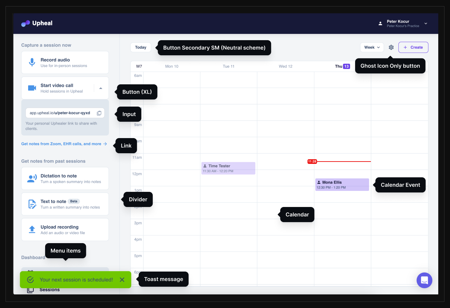
Image 1: A quick component audit of the current state
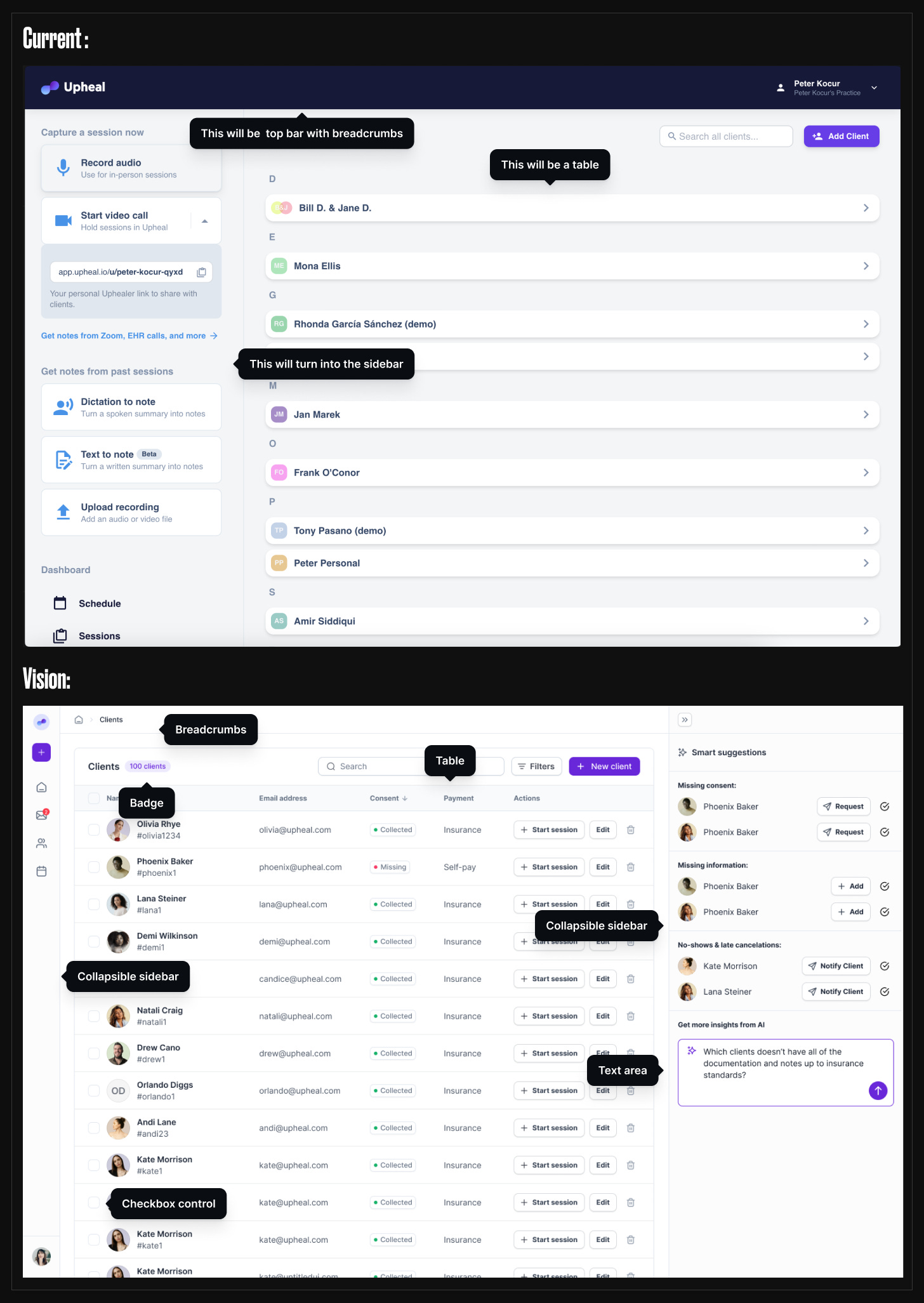
Image 2: Combining an audit of the current state and the vision to understand components needed for both current and future versions.
How to pick a library or a UI Kit
Now that you understand your component needs, it’s time to start the hunt. This is where you need your engineering counterpart. The most critical questions are:
Are you rebuilding your codebase, restyling your existing components, or doing a combination of both?
Let your engineers drive this decision. They’ll work with the library long-term and will likely have opinions and preferences—whether it’s prop-based, like Chakra UI, Tailwind-driven, like Hero UI, or shadcn/UI. Going deep into technicalities is outside my knowledge and depends on your entire stack. In the future, I’ll collaborate with one of my beloved engineers on this topic, so if you’re interested, there will be an article.
As a designer, your input is valuable and should influence the decision. You should reference your audit and vision to ensure the chosen library supports the necessary components or is easy to customize. Also, check if the library has:
A Figma kit to jumpstart your work (though you can always restyle any library to match your chosen kit, even if you start from scratch).
Support for color modes, theming, and accessibility. The majority of good libraries support this by default.
AI is another thing to consider. Tailwind is so prevalent that AI-powered code suggestions and completions should work well with it. Also, Tailwind-based libraries can serve as both inspiration and a source of easily copyable code snippets to style your components faster.
If you decide to keep the existing code and only restyle the components, I would still recommend buying a design library like AlignUI, UntitledUI, or using free options like shadcn/UI and HeroUI. You’ll customize and delete a lot, but you don’t start from scratch.
At Deepnote, I built our library from scratch, but I frequently pasted components or drew inspiration from these kits. It made more sense for that particular setup, but having other libraries at hand sped up the entire process a lot.
Checkpoint: By this point, you should have mapped 80% of your components and selected a library that covers the majority of them. Let’s move on.
Selecting icons and why they matter
Your interface’s visual language relies heavily on colors, typography, and icons. Illustrations, if you use them, also add a lot to the mix, but they are not always persistent in the interface. Icons are. Not only do they influence the aesthetic, but they serve a very important function and influence usability.
Icons can make or break pleasant designs. You can spot Material icons from miles away. It’s not the prettiest look, in my opinion, but they work. Consider using them only as a last resort.
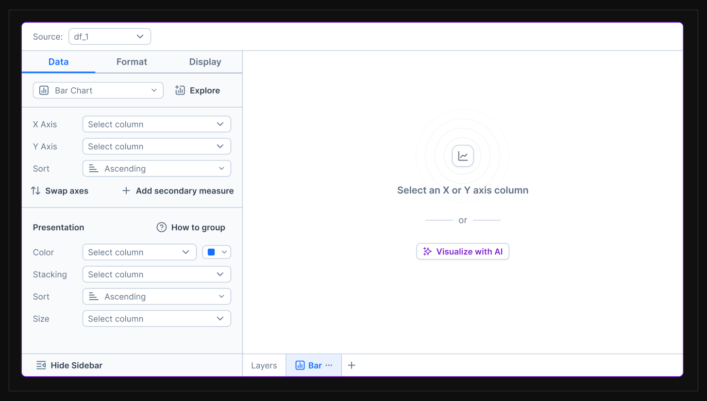
Image 3: Icons enhancing visual style while serving a functional purpose.
Here are a couple of things I’m looking at when selecting icons:
Visual fit in your interface (test icons on key screens).
Line and solid versions for flexibility and communication of active states.
Set size—is it big enough to cover most of your needs?
Level of detail that works at 16x16, 24x24, and 32x32 sizes.
Figma optimization.
Organization and semantic naming (e.g., if you search for “document,” “file,” or “sheet,” the same icon should return as one of the results).
Package availability for easy plug and play into your codebase, plus the icon properties like color, size, and stroke width.
Here are a few that I like: UntitledUI Icons, Griddy Icons, Coolicons. These could be imported as packages: Lucide Icons, Remix Icons, Iconly.
The icon setup
At Deepnote, we chose UntitledUI Icons for their aesthetics, organization, and variety. The downside? There is no npm package. We added icons manually—a tradeoff we accepted.
But to play it safe, I decoupled icons from the design system by publishing icons as a separate Figma file. Components in the design system referenced a “Placeholder Icon.” If we decided to switch icon sets later, we could easily relink the placeholder to the new set.
Image 4: Icons published as a separate Figma file.
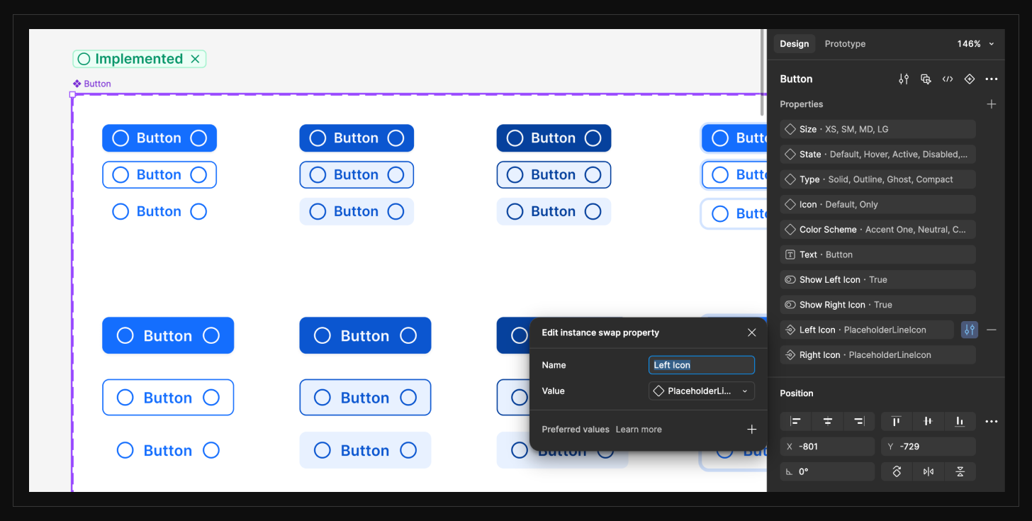
Image 5: Using a placeholder icon for potential easy future swaps.
Limiting your icon set
I realized that in some instances, we had more than four icons representing the same meaning (e.g., Alert, AlertCircle, AlertSquare, AlertOctagon). You rarely need this. Try to pick one version and stick with it. Boundaries in design help with consistency, speed, and ease of maintenance.
How to define a subset of your icon set
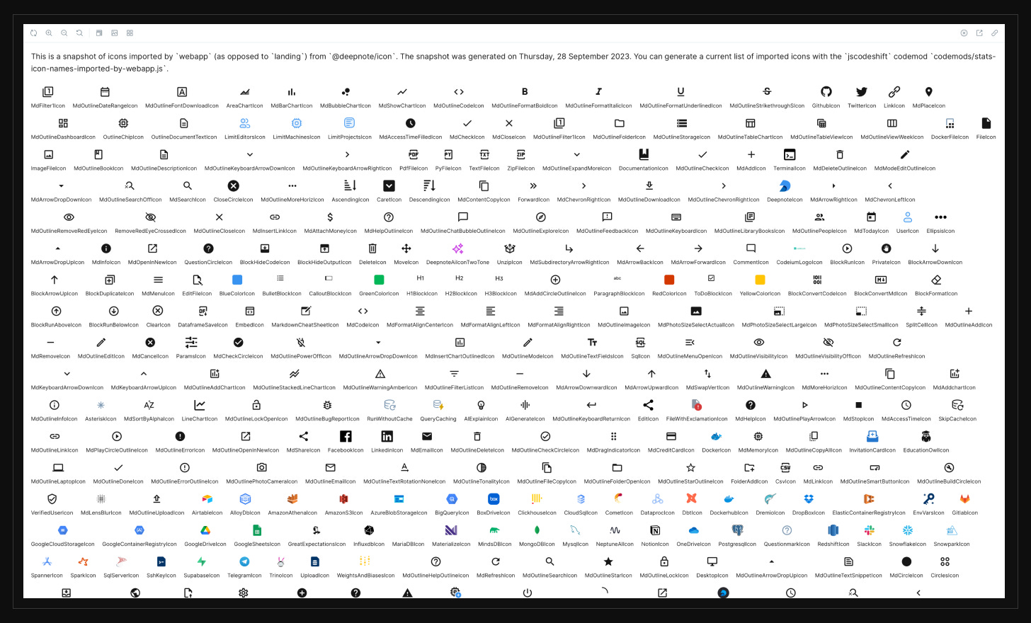
Audit the icons in your codebase. Ask your engineer to extract all icons and plot them in a grid.
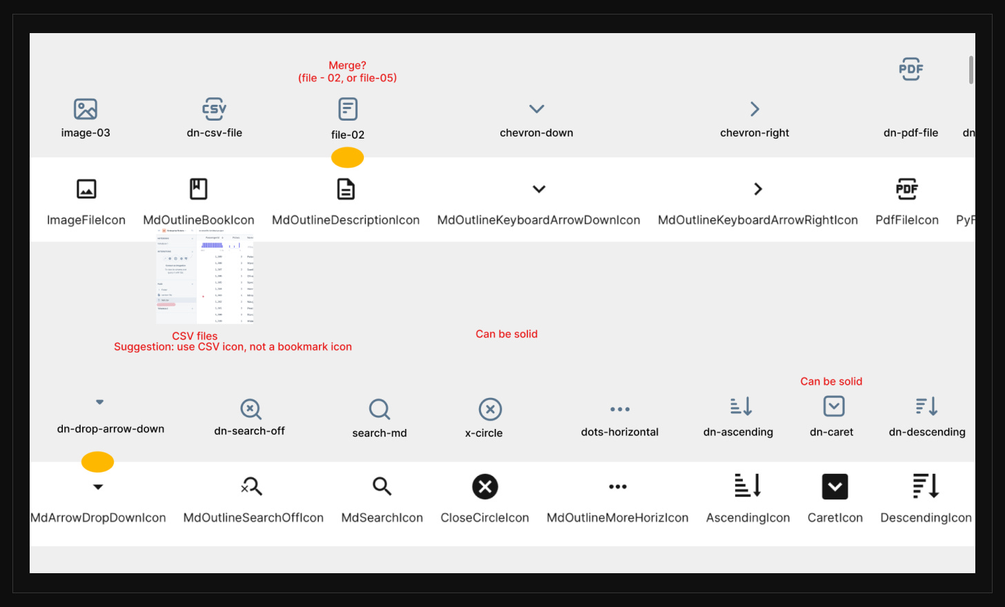
Remove duplicates and merge similar icons with the best representative icon.
Map current icons to your chosen icon set.
Identify gaps and create custom icons where needed.
How to organize your icons
We only kept icons we used in our product in our set to keep everything tidy and simple.
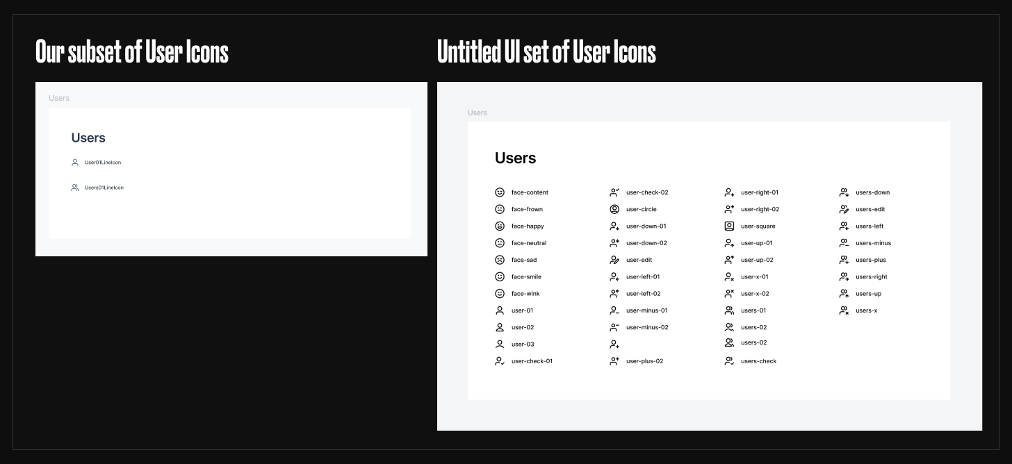
Image 8: Only the icons that we needed made it to our icon set.
If someone needed a new icon, this was our process:
Check the current Deepnote Icon set.
If you can’t find the icon, check for the icon in the UntitledUI Icon set.
If you find the icon, bring it over to the Deepnote icon set, into the correct section.
Update the name to follow our conventions. E.g.,
upload-03from UntitledUI was calledUpload03LineIconin our library - to keep it 1:1 with the code and make it easier for our engineering team.
If you can’t find an icon in either of the sets, ask Peter to create a custom one.
How to create custom icons
You probably find yourself in a situation where none of the icons from your set work. And you will have to create a custom one. The beauty of large icon sets is that you can usually get very far just by combining pieces of the existing icons. You don’t need a dedicated icon designer.
Just ensure that you follow the setup of the previous icons so that when you swap instances, everything works as it should.
Let’s say I want to depict medical support. None of the icons from UntitledUI works. But I found two icons that I could combine to create a new one.
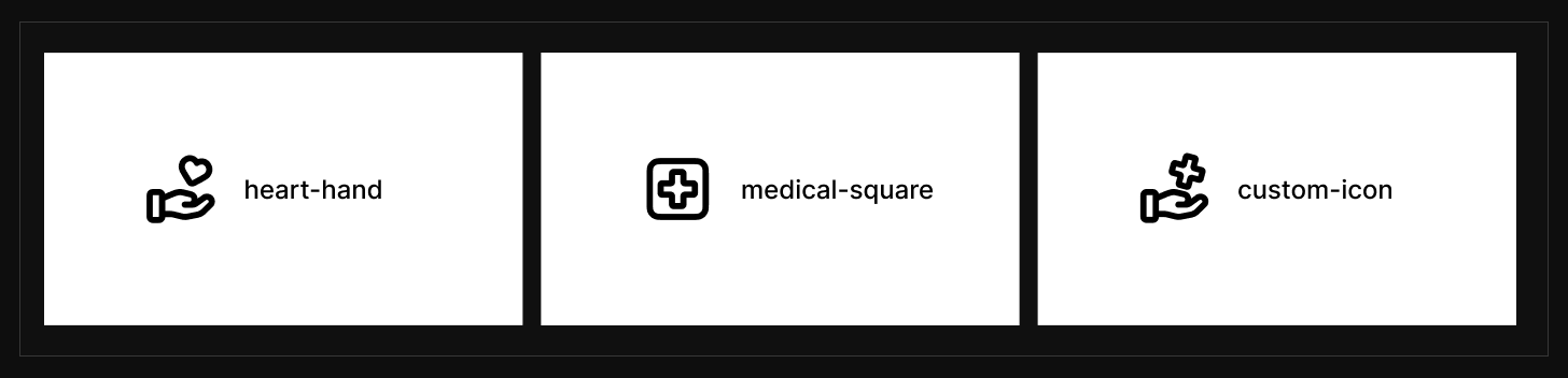
Image 9: Mix and match two icons to create a new, custom one.
Each of the icon components has a vector file named Icon with a 2px width of stroke and round caps. Also, this path is set to scale horizontally and vertically. It’s important to follow this setup. Otherwise, scaling or swapping instances won’t work.
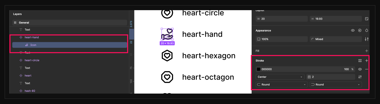
Image 10: Always follow the icon setup from your library when creating new icons
Combining the icons
Because of this setup, I will have to either delete or paste anchor points and paths so that I achieve just one final path called Icon.
The way to do it is better showcased in the video. So here it is:
To recap - you should have the list of the components needed. Library or UI Kit as a starting point and the icon set. Each of these will expand or contract as you progress with the design system. Remember, it’s an iterative process.
What’s next
In the next episode, we will continue with setting up the foundations. We will look at typography - a short and sweet overview with a couple of tips.
If you’ve made it this far, thank you. My goal is to make this as helpful as possible, so if anything is unclear, let me know (reply or comment)—I’ll update the post or answer your questions directly. And if you think someone else might find this helpful, please share it.
See you in the next one.
– Peter