

How to build a design system fast. Episode 1: How to start.
Getting buy-in, making the case, and executing without slowing the company down.

In the last article, I covered why you should build a design system early and that it can be done fast. Now, let’s talk about where to start—and, more importantly, where not to.
Your starting point likely falls into one of these categories:
You have a design system, but it’s outdated and inconsistently used. Figma is a mess; no one trusts that what’s there is also in production because it isn't. New designs are stitched together by copy-pasting from old projects and designs from scratch.
You don’t have a system at all. Everything is built from scratch, with little to no components. If there are components, they’re local, not global. Engineers have picked a UI library, and your design was added on top.
Your design system is fine but outdated—built before Figma had modern tools like variables and modes, making it harder to scale. If that’s your case, future articles in this series will be more relevant.
I’ve seen all of these, and while each case is different, the underlying problems—and solutions—are surprisingly similar.
Step 1: Where not to begin
If you want to get buy-in, don’t start by talking about designers.
A design system should enable you to create value as fast as possible. Don’t mention arguments like making designers’ work easier, improving collaboration, attracting better talent, or even consistency and reusability.
Those all are true, but your company has already gotten this far without a design system—why should anyone believe it’s urgent now?
If your stakeholders aren’t former designers, they probably don’t have a mental model for what a good system enables.
Imagine your platform engineering team proposing moving to a multi-tenant Kubernetes architecture to improve utilization, reduce downtime, or improve workload isolation. Sounds important. Would you care? Unless you’re deep in infra, probably not. Improving conversion rates on in-product upsells would seem far more tangible and probably important.
Don’t assume anyone cares about design ops.
Show the pain, and solve it
Building a product without a good system is literally throwing money down the drain.
Let’s put rough numbers on it:
Hours spent looking for designs, guessing component usage, and referencing what’s in production.
Rounds of unnecessary comments in Figma because things weren’t clear upfront.
Engineers implementing things from scratch, creating inconsistencies that get flagged later.
The mental energy spent on all of this instead of actual product work.
Now add to that the opportunity cost—research, discovery, and high-value work getting delayed or not done at all because people are busy fixing buttons.
So, your case isn’t about making design more enjoyable. It’s about making the business faster and your product better while reducing costs. Most founders and execs won’t ignore that.
Evolution, not a revolution.
Another common mistake is treating the design system as a massive, standalone project.
I’ve seen the version that went on for a couple of years. It was painful for everyone, and no one did it on purpose. How to prevent it?
Start small. Keep it lean.
Define decision-makers early. In many startups, this means the founder. If there are multiple founders, identify the one who will make the final call. On your side, have a single responsible person for design (I will assume it’s you for the rest of the article) and a counterpart in engineering.
Resist design by committee. Design is visual, and everyone will have opinions. But if you let every stakeholder weigh in on every detail, you’ll move slowly, and it won’t be for the better. Keep the decision-making tight.
Step 2: Present a plan
Before you bring this up internally, you need a plan. A good rule of thumb is never to discuss problems without having a rough idea of how to solve them. This applies far beyond the design systems. Once you get the initial discussion rolling, have this plan formulated. This can be a simple four-slide deck, a Loom video, or a structured Slack message.
Here’s how I structure mine:
Outline the goals:
What will this achieve? Examples: A modernized UI, style definitions, tokens, and components that cover the entire product.
What won’t change? Examples: Branding, tone of voice, fundamental product experience.
Outline the approach:
What are the key stages? Example: A short design sprint for vision, building a Figma component library with a semantic layer, custom icons that are not included in the icon set, and implementation to code.
When will feedback be collected? Who will be involved?
Time-box the effort. If you’ve never done this before, use these episodes to guesstimate—but lean towards fixed deadlines and variable scope.
The goal is to get the MVP design system out fast in an 80/20 fashion. You will fix the remaining 20% over time.
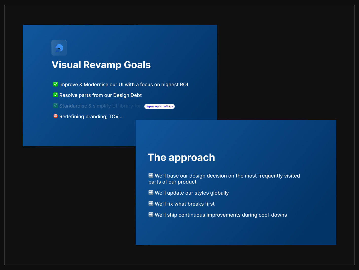
Image 1: A barebone, tasteless presentation with a few bullet points used at Deepnote.
Step 3: Execute immediately
Don’t postpone it. Move to the next step immediately after getting the buy-in.
Identify core screens (2-6)
Define the screens in your product where the majority of the user experience occurs or can be derived from. For example, at Deepnote, this was the notebook (where users code, write text, and visualize data) and workspace organization. There were plenty of other screens and flows, but those two covered most of the frequent user experience.
Run a focused design sprint
Invite designers to contribute to the vision, but don’t overcomplicate it. Two weeks should suffice. Keep the sprint to two weeks. There’s no need to go full-time—just ensure everyone has enough focus time to generate meaningful ideas. But don’t put the entire company on pause. Each person was responsible for blocking off focus time, as the week would end with an internal design review.
Design the vision
The goal here isn’t a pixel-perfect, well-thought-out design. It’s to see how components and systems work in action on your most crucial screens. You will fine-tune everything later—globally.
Think in terms of components and style, but hack it together as needed (no auto-layouts and hex values are fine)
Be resourceful.Be resourceful. The best sizes, paddings, and patterns for buttons, form controls—you name it—have already been figured out. Use components from well-designed libraries like shadcn UI, Hero UI, Align UI, or Untitled UI. Don’t reinvent the wheel where unnecessary. Focus on how to apply the building blocks specific to your product needs.
If a library covers most of what you need and is already coded, that’s a huge advantage—it can speed up both design and development. But in my experience, some level of customization is always necessary. Either way, leveraging an existing system gives you a solid foundation to build on.
Review with designers first
Pick what works and discard what doesn’t. Not everyone will be happy, but they should understand this is the 0-to-1 phase. Being strict now will make future updates much easier and faster.
Polish the ideas into one united concept to be presented. This is usually done by one designer with the most favorable concept.
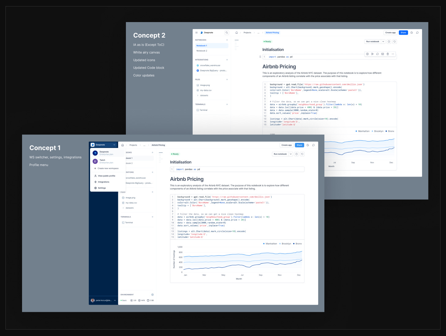
Image 2: A preview of two out of the four concepts created for internal review.
Get the buy-in on the design direction
Get feedback on the vision from your decision-maker and other crucial stakeholders. In our case, we invited our PM and tech leads. However, it was understood that at this stage we are mainly looking for feedback from our CEO on the overall look and feel, not the details on components or implementation.
Once we got approval, we gathered feedback from the broader team asynchronously. While we considered input from everyone, the final decision lay with the design team.

By this point, you’ll have a strong sense of how the product should look, and what are the foundations for styles, colors, typography, and icons.
You have the north start. What’s next?
In the next episode, we’ll start turning this vision into a working system.
How to choose the right component library—and what are the options
How to define a list of the key components needed based on your current product
How to define a list of icons needed based on your current product
How to select a good icon set, and how to create custom icons
How to define typography styles in Figma
In the episode after the next one, we will explore colors, the semantic layer, and how to set everything up so that your library supports light and dark modes and theming from the start.
If you’ve made it this far, thank you. My goal is to make this as helpful as possible, so if anything is unclear, let me know (reply or comment)—I’ll update the post or answer your questions directly. And if you think someone else might find this useful, please share it.
See you in the next one.
– Peter