

How to build a design system in 6 weeks, and why you should do it.
A practical series on building design systems fast.

I never set out to be a “design system” person. Rather than focusing on creating bricks, my excitement stemmed from building a city. But, to my surprise, I’m building a design system for the fourth company in a row.
Along the way, I developed a deep appreciation for them. It turns out the quality of bricks can make all the difference.

Before diving into the how, let’s talk about the why.
Why bother building a system? Why not just wing it until you have more resources? More features? I say you should have it as early as post-MVP, but perhaps even while building it.
The common arguments for having a system—consistency, unified visuals, and standardized interactions to prevent user confusion—are fine. But the reality is that even with the best design system, things will sometimes be inconsistent. So if that’s all you’re aiming for and trying to sell, you’ll be disappointed.
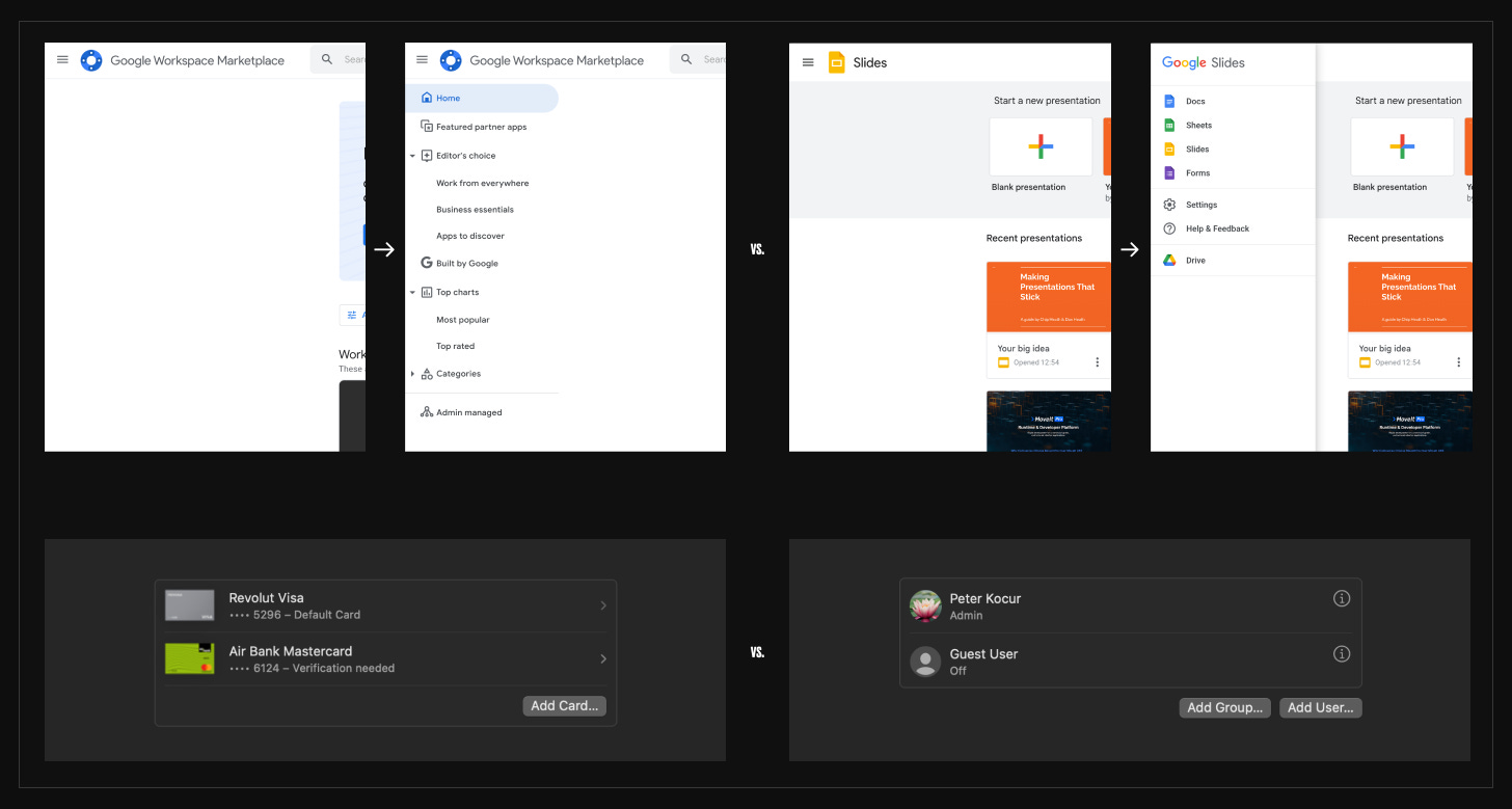
Image 1: Same components, inconsistent behaviors—sidebar push vs. sidebar overlay, adding an element within a container vs. below.
The real value of a design system is in speed, focus, and self-imposed limitations.
When your team designs buttons, tabs, or modals from scratch or searches for them to copy and paste through Figma files, you’re slowing the entire company down. This can eventually kill it. Minor issues and slowdowns tend to accumulate.
How many tabs do you need? Two? Five? How many slight variations of an info icon are floating around in your product? Every time you decide to build a new element, you drain resources from yourself, engineers, and everyone else who will need to learn, maintain, and eventually refactor it—creating design, code, and cognitive debt.
Time and effort that should be spent on customers, products, and improving the bottom line are wasted on trivial tasks.
Building an interface should feel fast.
The point of a design system is to eliminate this so that you can focus on translating strategy into flows, converting user problems into seamless experiences, and thinking in terms of the product, not the components. Stack your building blocks on the canvas so you build as you think. The material, the foundation, is not stopping you. You’re feeding off the visual feedback to get a sense of the interaction as you go through flows, not the individual interactions—they are already figured out.
Building a design system requires discipline. You will feel the temptation to add a new pattern just for this flow or stray from the system. Resist it. Save your creative outbursts for landing pages, assets, or interactions that can be applied globally and improve the system as a whole.
The rest of the time. Ship fast. Create value. Improve the business.
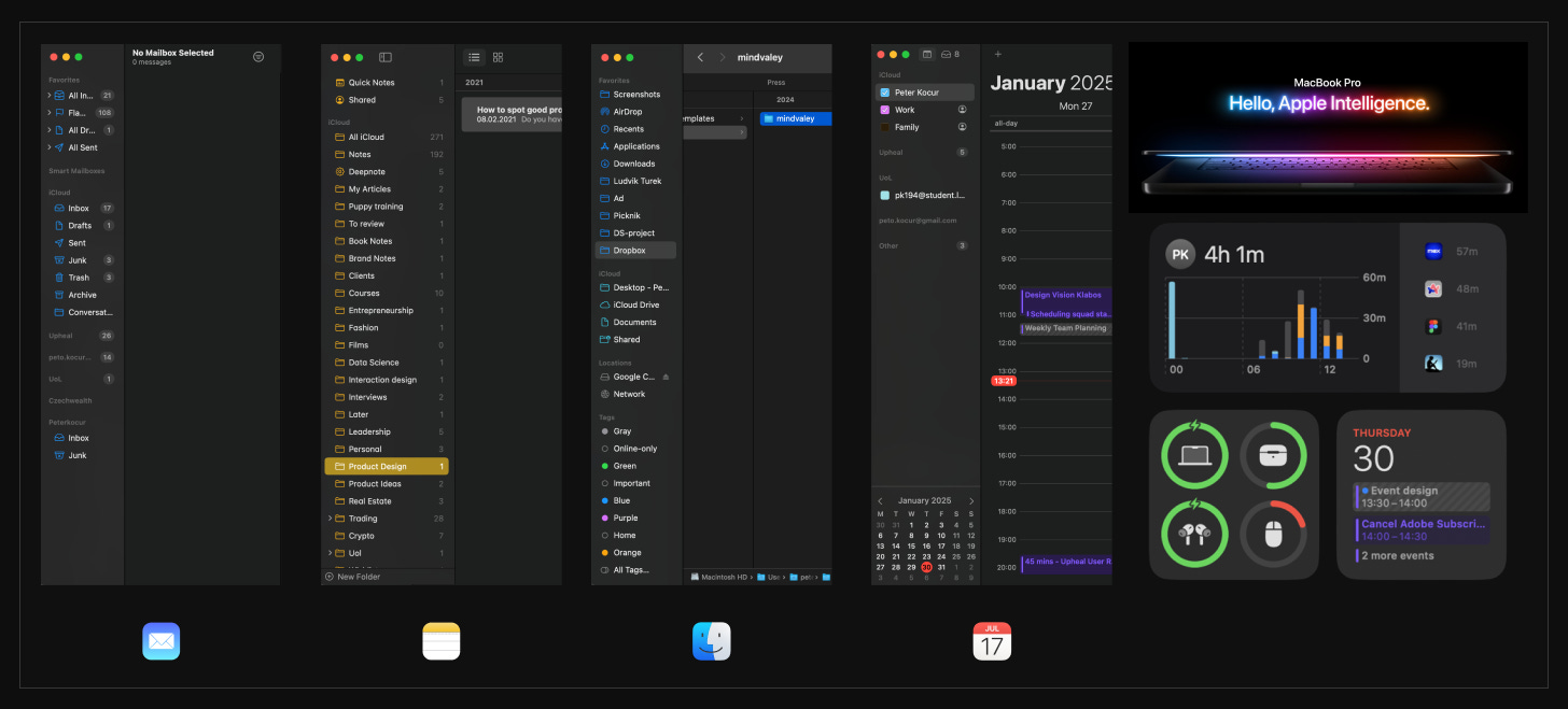
Image 2: The same “boring” components to build 4 different apps. And the creative magic.
Now, you might think your product is too complex for this. You can’t stop building features, and designing and coding the design system is a massive effort. But it doesn’t have to be.
What does it actually take?
Typography, Colors, Icons, Depth, and Space. These are your foundation.
Core components. Avatars, buttons, cards, form controls, menus, tables, and a couple more.
You’re ~80% done here. You can recreate the majority of interfaces with a few core components and solid foundations.
The rest falls into the convenience category of composables that combine your fundamentals. Breadcrumbs, for example, are really just font, buttons, and icons.
The beauty of this is that once you have the fundamentals figured out, everything else gets easier and faster, providing feedback to iterate on the fundamentals again.
For example, Deepnote combines a development environment, business intelligence, data visualizations, real-time collaboration, and extensive AI interactions. It gets complex. Still, we managed to revamp our visual language, create a new Figma library with new icons (and custom icons), use a semantic layer with theming and modes, clean up the code base, and ship it within 6 weeks—with just two people.
Over the next few posts, I will break down how we did it.
We will go into details and practical tips on:
How to start, who to involve, and how to sell the idea.
Defining tokens, typography, and creating a semantic layer.
Building a Figma library and deciding which components you actually need.
The engineering point of view, in collaboration with Andy.
Maintaining, evolving, and democratizing the system.
If you’ve made it this far, thank you. My goal is to make this as helpful as possible, so if anything is unclear, let me know (reply or comment)—I’ll update the post or answer your questions directly. And if you think someone else might find this useful, please share it.
See you in the next one.
– Peter